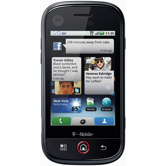
The Motorola Cliq is one of the latest in the ever-growing Android family; a T-Mobile exclusive. I’m here to tell you my Motorola Cliq experience.
Some geek specs
| Processor | Qualcomm MSM7201A |
| Processor Clock Speed | 528 MHz |
| RAM | 256 MB |
| Flash ROM | 512 MB |
| User Storage Available (max) | 256 MB |
| Memory Card Type | FAT32 microSDHC, Class 6 |
| Memory Card Size Supported (max) | 32 GB |
Display
| Physical Resolution | 320 x 480 (HVGA) |
| Number of Colors | 64K (256K via hardware dithering) |
| Pixel Density | 160 dpi |
| WAN: Voice Bands | GSM 850/900/1800/1900 W-CDMA 900/(1700 or 1900)/2100 |
| WAN: Data Bearers | GPRS/EDGE Class 12 HSxPA |
I’d like to state right now that I am not a phone expert. This review is a “by consumer”. Any comparison’s made to other phones are going by what I’ve experienced by owning, read or seen at stores. I will go through the whole experience from opening the box to my daily use of the phone.
The Motorola Cliq is an Android phone.
My Experience
I have been using the Blackberry Pearl for the last two years. The trackball kept putzing out and it had visible battle wounds from being dropped numerous times. It was getting to the point where it would freeze when opening pictures, and the web browsing experience was horrible. After some careful research, I ordered the T-Mobile Motorola Cliq in Winter White 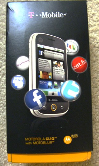 through a phone upgrade and contract extension on Black Friday, saving $50 off the regular price of $199 and getting the phone for $149.00. Tack onto that tax, the obligatory $18 upgrade fee and shipping, I was still sitting nicely under $200. I chose standard shipping, and still the phone was shipped on Monday, November 29th and I received it on Wednesday, December 2nd (pretty quick!). I was stuck at work while the phone was shipped to my home address (wasn’t worth the hassle of calling customer support to get around their “security” of shipping to the billing address) so I spent the whole day tabbing over to the UPS website and refreshing the tracking status.
I got home and was surprised to find the phone in a bubble-wrap bag instead of a box. The outer box wasn’t damaged at all, though, so I guess it wasn’t a horrible thing.
Opening the box proved to be a task. The box indicates to squeeze at the bottom on the sides to open. I did so, and nothing. Finally I just pulled out the bottom of the box, no squeezing required.
Inside the box awaited the ever so shiny Motorola Cliq, a USB cord for charging, wall adapter, the battery, a wired headset (does anybody use these??) and a recycle bag for old phones. Immediately you could tell the phone had substance, even without putting the battery in. I’m always wary about first opening the back cover, always afraid I’m going to pull so hard and break the tabs or something. There’s little trick to it though, simply pull up on it and gently wiggle it in a down/up motion and it’ll pop off. You must insert the SIM card before you put in the battery, which I found somewhat disappointing. It already comes with a micro-SD card which should be pre-installed.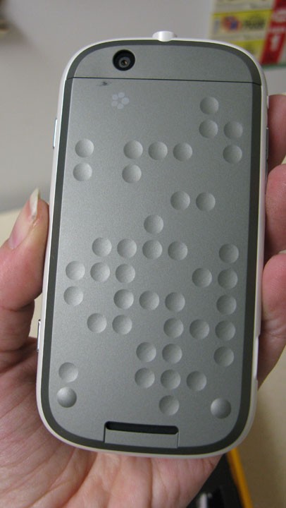 The SIM card insertion was wayyyy easier than the Blackberry pearl. Simply lift up on the little black lever and slide the SIM card into the slot until it goes no further. Put the lever back down and put the battery in! If you’re still having trouble refer to the starting guide. It’s so pretty! The back has little circle indentations and when you open it and turn it around you see the Motorola symbol!
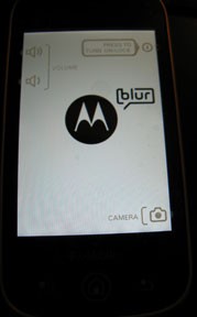
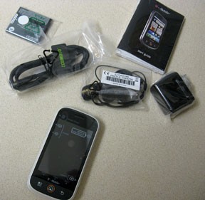 There was some juice in the battery but I still plugged it into my computer using the USB cable. The Motorola Cliq uses a micro-USB charging, as that’s going to be the new universally agreed upon standard (if my memory serves me well, I think even the iPhones will start using it). So you may be out of luck with your old chargers, but anyone you get in the future should be able to use the one from the Cliq. The power button is a small side-button on the upper right hand corner of the phone. I pressed it and the screen came to life with the Motorola “M”. I waited…did I turn it on or was it just at some charging screen? I pressed the button again and nothing happened. After waiting for what seemed to be eternity (seconds) there started blinking a little “Blur” icon next to the M. Finally, the T-Mobile symbol appeared and the phone started up! In my later uses of the phone in turning it on or off the start up process has not been any faster. Sigh. I’d also like to note that when using the wall adapter to charge, the length or cord is VERY SHORT.
First step in setting up the Motorola Cliq is setting up a Motoblur account using an existing email address. There is no way around this. Easy cheesy process. I took the typical man’s route and did not refer to the start-up guide instruction manual. It comes with up and down buttons on the upper lefthand corner for volume adjust, a button on the top right hand corner for power, lower right hand for camera, menu button, home button and back button below the screen and a switch for silent mode.
If you’ve never used an Android phone before, there is definitely a learning curve involved. Once you get everything set up, which is a simple and pain-free process, then comes the fun part. I did not sync any of my social networking accounts at first, because I wanted to get a lay of the land before it got overwhelming and I was sitting in the corner rocking back and forth and crying. Home screen starts you off with the Happenings widget, Messaging widget, and Weather. The Accuweather widget lets you select multiple locations to get weather. Figuring out how to change it was fairly simple, simply touch the widget, and use the menu button which brings up the options for Settings. There you can delete the default cities and add the cities of your choice. The city on the top of the list is the one your phone defaults to on the home screen.
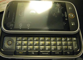 The homescreen comes with 5 different pages for your shortcuts and widgets. Pressing and holding on the screen will bring up the settings to add more stuff to your homescreen. If you’d like to move a shortcut or a widget you simply press and hold over the icon, and when it vibrates you are free to move it (without letting go!). This is also how you delete the clutter you don’t want, you simply drag it to the bottom of the screen to the trash can icon.
At first the touch screen seemed finicky and inaccurate (especially when trying to type out a message). Going into your phones settings and checking for a system update should reveal a new update released which fixes touch screen inaccuracies and adds a new battery manager (does some other things too).
If you’ve read other reviews, you know that the battery life on this SUCKS. The battery manager lets you select different performance modes to help you save on battery. I haven’t suffered from a dead battery during the day yet.
I linked my Facebook account. It’s not that bad, at first it seemed like I would get the LED indicator light every time there was an update, but now it doesn’t appear to do that. I’ve apparently found the cure in my tinkerings. I *THINK* when you open “Messaging” and select “Messaging Settings”, if you turn off the status bar notifications and vibrate under Social Messaging is what did the trick for me.
If you get one, turn it off and plug it into the charger. You get this cool liquid battery level thing.
 The Motorola Cliq has a 5.0megapixel camera. There is no flash, but with the Pearl the flash was AWFUL so I didn’t think it’d matter much with this camera. Low-light areas are pretty difficult to take clear pictures in. The picture quality in daylight and brightly lit areas end up pretty nice, however. The camera phone “hot” button is on the side of the phone in the lower right. This is also the button you press to take a picture, which can make it really awkward trying to balance the phone in your hand and press the button to take a picture, especially if you’re trying to take a picture of yourself. There is a little camera icon on the touchscreen but it’s kind of finicky. It DOES have an auto-focus feature that’s pretty snazzy and digital zoom (meh), but all in all, I wouldn’t really consider this a big thing. One of the neat things is with the Motoblur account and other features of the phone you can instantly share pictures you take on your Facebook, Picasa, MySpace, etc. There are some picture editing options, your typical rotate & flip, auto-fix, crop, color style, frames, clipart, resize. All pictures are stored in one place in the Picture Gallery, so you better be careful of the pictures you take if you’re going to show off your gallery to people. See my beef further down.
The phone also has video recording capabilities which seemed solid. No zoom or anything special, just point, shoot, and record.
Call Quality was very good in my opinion. People on the other end were very clear, and said the same thing about myself. They also stated that it was strange kind of “digital” sounding, not bad though. The call noise reduction really seems to work well. Usually people can hear my chatty cat or television in the background, now they just hear silence when I’m not speaking. There is a volume adjust on the left hand side.
Making calls is fairly straightforward, you can find contacts through your Contact List, or the Dialer. The Dialer is pretty neat. This stores your call history, your Speed Dials, Frequent calls, AND a dialer featuring a traditional telephone numberpad. I struggled sometimes with my Blackberry Pearl and it’s qwerty layout. I want to call 1-800-CONTACTS…crap what number is C supposed to be? Won’t happen with this phone.
Signal quality is just swell. In non-3G areas it still seems to operate pretty quickly, and I still receive my Facebook updates and am able to download from the Android Market. My apartment was a near dead-zone for my Pearl, I haven’t had hardly any issues with the Cliq. Droped calls are down 95% percent and I’ve only had one text message not go through due to signal issues.
Adding music to the phone seemed a bit unrefined. There is no software or anything, you simply plug the phone into the computer using the USB cord and select USB Drive when it pops up that the USB is connected.When the Removable Disk window pops up on your PC (no Mac to test this on, sorry guys) you simply select the “Open Folder to View Files” option. Drag and drop your music files into this folder. Go the top notification bar and select “Turn off USB Drive” when you’re done. It’ll give you a Preparing SD card message before you can go to your Music app and see any and all of the songs you put on there. When you select a song it gives you the option to Use as a Ringtone
My Beefs
At first I admit, I was really apprehensive about the phone. It’s nervewracking getting a new phone! It’s like a new relationship, you’re not sure if the new one will perform like the old one, give you the sense of comfort your old one did… you wonder whether it’s an improvement or if you should stick with what you know. I’ve had the phone about a month, and it’s love. I do have a few beefs.
1. No hard button to end calls. When you make a call, in order to end it you must press a button via the touchscreen. On the eve of its arrival I was playing with the phone and accidentally called someone. In panic I touched something else which switched off the call screen. Being a newbie I couldn’t figure out how to get back to the call screen quickly, so I ended up taking the call, explaining that I’m a loser and didn’t mean to call, listened to the caller laugh at me for a couple minutes, then waited for them to hang up. None of the hard buttons will end a call!
2. Lack of customization/Indicator Light. I’m not certain there aren’t things I can do, and I’m not certain of the things I did to get what I got. That’s confusing. The lack of customization I’m referring to is in notifications. I cannot set certain things to vibrate nor can I set the number of times I want them to vibrate. I can change ringtones from the list of ringtones (adding songs as ringtones is fairly straightforward). The LED notification light is nearly rendered useless because of this: It blinks with emails, messages, low battery, missed calls, voicemails… it’s hard to tell why it’s blinking. What’s that Cliq? You’re trying to tell me something? New email? New voicemail? Low battery? Now I have to stop being lazy and wake it up to check. Also, when the battery is fully charged and still plugged in, the indicator light is ALWAYS on.
3. File manager. I’ve read this on many reviews and thought to myself, well that shouldn’t matter to me. Wrong. The first place I want a file manager is with picture. Everrrrrrryyyyy picture you take is stored in your phone’s gallery. To my knowledge there are no ways to move or hide the pictures besides removing them from the phone. Until there’s a workaround for this, I’d recommend removing the scandalous pics like I do.
My Dislikes
There are some things I’m not a fan of on the phone, but I wouldn’t consider them a beef. They’re just a different way of doing things that I’m not used to, and I’m mostly stubborn and stuck in my old ways.
1. Text Messages. In my Blackberry I would set it so I could see every individual text message in my inbox. This is especially useful in the “but you said” argument, I can just scroll through the list and find the text message to which I’m referring to. Now, every message and interaction with a contact is in one spot, conversation style like Gmail. Not necessarily a bad thing, just not what I’m used to. Vibrating for text messages is two short “buzzes”. If you’re not near the phone you’re not likely to hear it.
2. Contacts. When you link your social networking sites to your Cliq it adds alllllll the contacts to your “contact list” (no “Address Book”). When you open it, it defaults to “All Contacts”. I mainly use the contact list for making phone calls or looking up addresses. If you’re like me, and don’t have a lot of friends, it’s not that bothersome. I don’t necessarily want to see all of my friends name. You can touch the list type and change it by linked accounts (Facebook Contacts, etc) Motoblur Contacts, and your T-Mobile Contacts. You can also link accounts, too which comes in handy for organizing, but can be tedious depending on the size of your contact list.
3. Screen timeout. You CAN set how long it takes before the screen darkens and the phone locks. It’s not very smart though, if I’m installing an app I’m probably not touching it or actively participating in phone usage. So the screen timeouts and locks. With my Blackberry the screen would go dark to save on battery but it would not lock. It’s just a hassle to keep a finger on the screen at all times or having to go and unlock it (which is not some complicated procedure, it’s just an annoyance).
4. Cupcake. The Cliq currently uses Cupcake. I’m sure someday, in the future, they will upgrade to one of the newer versions of Android (at least 1.6, PLEASE?) Without at least 1.6, Cliq users are not privvy to the Google Navigation app with TURN BY TURN GPS. Want.
My Likes
1. Touchscreen. I have an iPod touch. I used to use the iPod touch in place of the poor browser performance of my old Blackberry Pearl. I pretty much despise the touchscreen on that. I always seem to hit the wrong button and it’s a slow process to correct mistakes. I adore the touchscreen on the Cliq! In my experience, it’s way more accurate than my iPod touch (again, can’t say if it’s better than the iPhone or every other touchscreen out there) but I find that it’s very pleasant. One of the coolest things ever about the touchscreen is that it WORKS WHEN I’M WEARING GLOVES. I don’t need to buy some special electricity gloves (ahem, iPhone gloves). Freakin’ sweet.
2. 3G. BEHOLD THE POWER OF 3G (only available in select locations). Lucky me, living in a 3G area. It’s QUICK. ‘Nuff said. The battery drain is totally worth it. In non 3G areas the performance wasn’t bad. Down in the boondocks I still managed to have an EDGE or GSM connection, and applications and the browser weren’t horrendously slow.
3. Keyboard. I haaaaaaaaaaaaaaaaaaaaaaaated the keys on the Blackberry Pearl. I hated having more than one letter to a key. I’m a texter by nature and I really do like the keyboard on the click. The buttons are slightly raised, giving them differentiation. It’s hard to type without looking, but again, I’ve only had the phone for a short time. The spacebar is nicely sized. The ONE thing I wish it had was an ALT key on the left AND right side. It makes typing the numbers on the left hand size of the keyboard somewhat difficult and slow, but it’s something I’m starting to get used to. In my opinion though, they have good feel and good placement. OH and they light up! And when you press the ALT key, the numbers light up separately in an orangey color. Size could be an issue for anybody with bigger fingers, but I think that’s pretty much the case with any phone on the market now.
My <3
1. Android Market. Yeah. It’s not as big as Apple’s app store, so I’ve heard. Big whoop. Size doesn’t always matter. Everything I’ve downloaded so far has been FREE. I have an app for my Google reader, Netflix, a couple games, a metal detector app (hard to tell if this one really works), a places app, a football scores app, a notepad app, a recipe app, etc etc etc. <3 <3 <3
2. Form. I love the size and form of the phone. It definitely has some weight on my last phone, but the size fits my hand perfectly. I used to get hand cramps talking on my old Pearl for long periods of time. Hasn’t happened with this one. I can also comfortably hold this phone against my ear and shoulder without it slipping out. I’ll admit, sometimes using the keyboard is awkward; it seems a little wide for me (but I have smaller hands), but overall the curves are beautiful and it’s not too thick.
3. Voicemail. I can OPEN A MENU AND SELECT A VOICEMAIL TO LISTEN TO. How cool is that?? With my Pearl I was forced to press and hold 1, press 1 to listen to new voicemails, and if I had been a little lazy and let the voicemails stack up I was punished by listening to the oldest first, press 7 to delete, wait for it… finally after a gazillion hours I was able to listen to the one voicemail I truly cared about. This is ALL solved. I simply bring tap on the voicemail icon, and tap on the voicemail I’d like to listen to. AND, there is also free Visual Voicemail which translates voicemails into readable text. I haven’t tried it yet, but the concept is cool as hell.
Overall, I’ll admit I’m very much in love with my phone and I’m super excited to see what’s in store for it in the future.
UPDATE: Motorola CEO confirmed at the CES 2010 show that the Cliq (along with the Droid) will be receiving updates to the latest Android 2.1.

